This project was very special as it was the first production where I designed all the screen graphics used throughout the film and also animated the majority of them. It took around 7 months to create over 400 screens, from the pre-production process to the final delivery of the on-set graphics.
The challenge I faced was to ensure I created realistic designs that were believable enough to look like technology that NASA will use in the future. As a result, this meant our studio, Territory, were in constant communication with NASA to ensure the content we were creating was accurate and on-point.
The project entailed working closely with Art Director Felicity Hickson from Fox and their production designer Arthur Max. We all shared the vision Ridley Scott had for this new Sci-Fi venture. The work created varied from producing huge 9m x 9m screen animations to small interactive wearable screens, such as the small screens found on the astronauts’ suits.
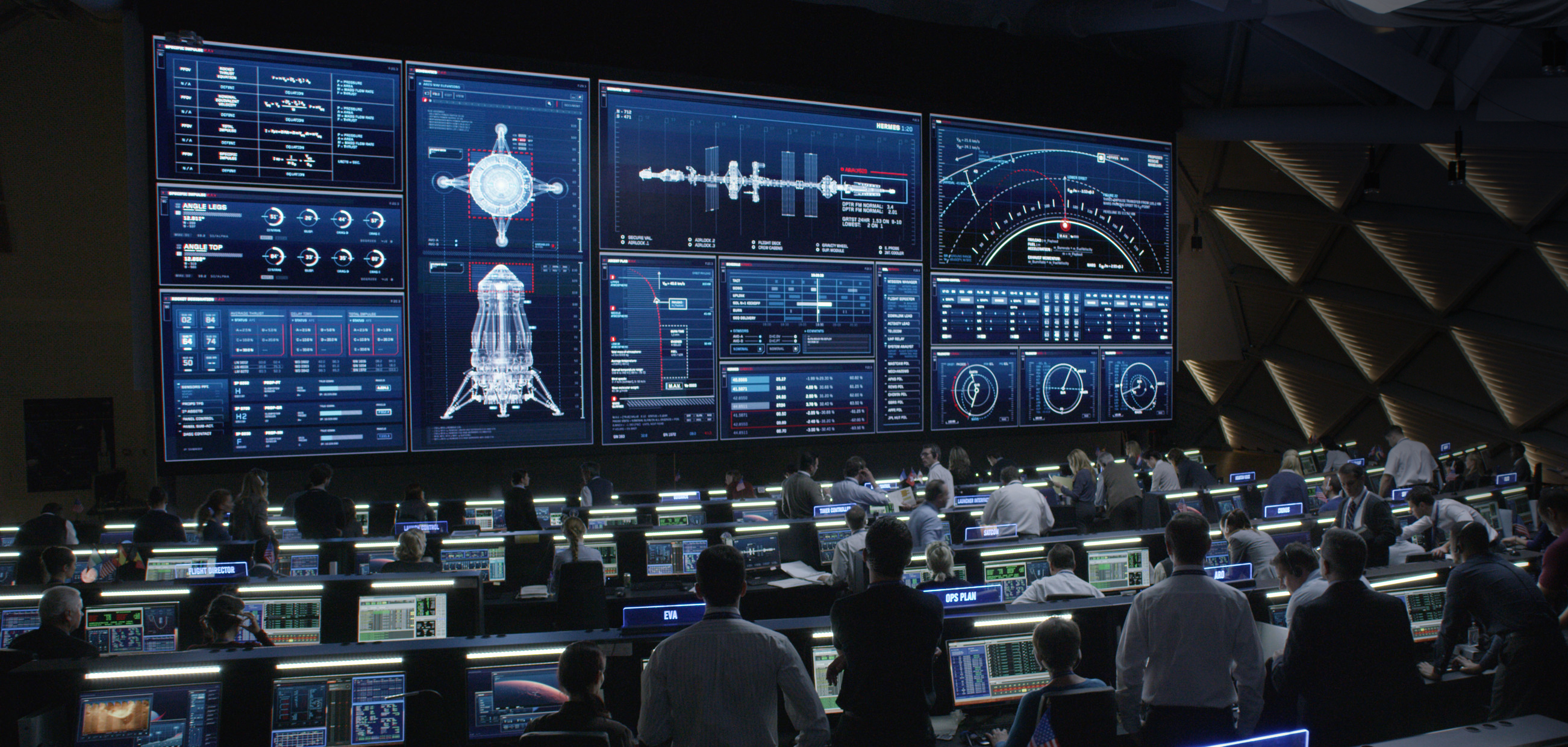
The Mission Control set featured the biggest screen I have ever designed. A 9m x 3m panel it was a key feature seen throughout several scenes during the film. This varied from featuring the ‘live’ video feed of the spaceship launching, to the Hermes ship or to the concise telemetry and flight data displayed on screen.
On top of that, I generated more than 80 bespoke screen designs for all the desk screens the fill up the mission control centre. To achieve an updated look and feel, I designed an operating system to wrap and re-skin the widgets and used real data from NASA’s actual mission control rooms. With a series of dark blue gradients, bright and detailed line work on the frames and vivid reds for the accents, the outcome was strong and futuristic enough to serve its purpose. For the Ares 5 launch, I created an updated version of the OS, using more rounded borders and a different colour palette.

The Mars Ascent Vehicle was a key set for the film. The M.A.V. is the vehicle the crew uses to go from the Mars surface to the main vessel- the Hermes. The screen designs needed to be realistic and display real telemetry functional data. I looked at real avionics data visualisation such as existing space shuttles and plane cockpits. The visuals had to be clear enough to tell the story and bolder enough for the actors to interact with the touch screens wearing gloves.

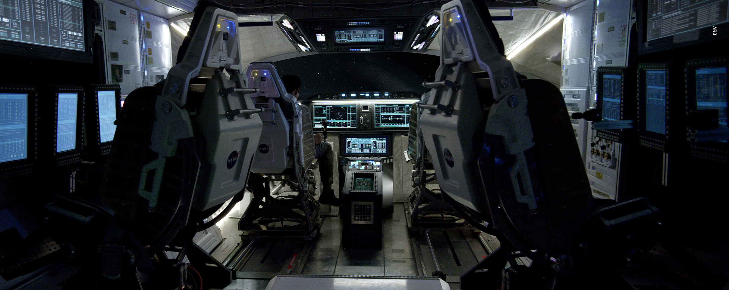
The main spaceship in the film is called The Hermes and it’s the vessel the crew use to travel from Earth to Mars. I had to design different sets to sit within the Hermes. The most complicated to produce was the main cockpit where a total of 12 screens had to fit perfectly on a designed frame. I had to design other sets like the flight simulator, the airlocks and the corridors functional screens. The inspiration came again from the real screens that NASA shared with us of their shuttles and space stations.


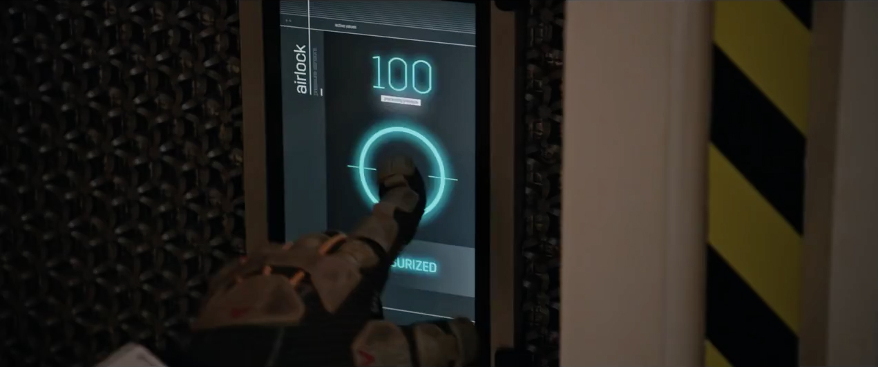
For the Mars habitat (HAB) set I took a complete different approach. I wanted to have a more realistic user friendly and clean interface where each screen had a dedicated function. With a very minimalistic approach and the “less is more” premise present in every design, the final style featured a simple OS framework using simple graphs, buttons and visualisations that everyone can understand at a glance. For this set, I generated screens displaying the likes of complicated weather storm scans, to screens for the airlock depressurisation to a simple toilet flush screen.

For the Jet Propulsion Laboratory, I created an operating system that uses the same technology that is in the Mission Control set but with some variations on the design. The set comprised of 3 big panels for JPL Mission Control, over 40 desk computers and hero screens for the Probe and Rover laboratory rooms.

I had to design the user interface for the computer that each member of the crew wore on their suits. After seeing some of the concept art from Fox, I decided to use the same orange/grey palette that was visible on the crew’s suits. The arm screens featured readouts from the environment and information on each crew member. The design needed to be bold enough for the characters to see the data clearly and easy for them to interact with the touchscreens whilst wearing gloves.


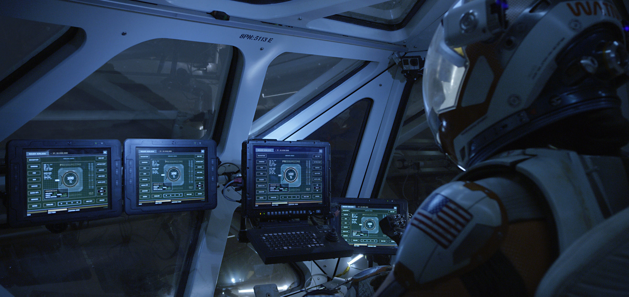
For the Rovers, I had to generate a very real set of screens based on the real-life operating system that NASA is currently producing for the Rovers they’ll be sending to Mars. Each screen could have a different function, so I designed over 20 possible screens, some being interactive. These ranged from ‘type in’ communication screens to ‘drive screens’ with camera feeds panning the surface. The whole set was stylised with a low res military feel to fit the resolution of the screens and framed to work with the array of buttons each screen had on the side.

20th Century FOX Credits
Director: Ridley Scott
Production Designer: Arthur Max
Sup. AD: Mark Holmes
Motion Graphics Art Director: Felicity Hickson
Territory Credits
Creative Director: David Sheldon-Hicks
Producer: Sam Hart
Art Direction: Marti Romances
Lead CGI: Peter Eszenyi
Design: Marti Romances
Animation: Daniel Højlund, Marti Romances and Sam Keehan.
Playback Credits
Compuhire
NASA Credits
Director, Planetary Science Division: Dr. Jim Green
Program Executive for Solar System Exploration: Dave Lavery
Manager Muli-Media Programs: Bert Ulrich
Showreel credits
Edit: Marti Romances
Audio: Zelig Sound
© 2015 Twentieth Century FOX, The Martian